 Wirefold
Every frontend developer has encountered a layout that looks crisp on a 1440px desktop monitor but breaks into horizontal scrollbars and overlapping text the moment you view it on a mobile device.
Describing responsive bugs to a chat-based AI assistant is famously frustrating: you paste twenty lines of JSX, explain that a card overflows at 375px width, and the model guesses arbitrary utility classes that break your desktop layout in return.
Why responsive fixes need visual context
Responsive design is fundamentally spatial and breakpoint-dependent. When an assistant cannot see the rendered viewport or target the specific DOM node, it creates three persistent issues:
- Global regression: The model swaps a fixed width for a full width without adding responsive prefixes (such as md: or lg:), breaking wider screens.
- Over-engineering: The agent invents custom window resize listeners or CSS-in-JS media queries instead of leveraging your existing Tailwind or CSS module conventions.
- Trial-and-error fatigue: You copy code back and forth between your editor and chat window, refreshing repeatedly to see if the overflow stopped.
1. Point at the broken breakpoint
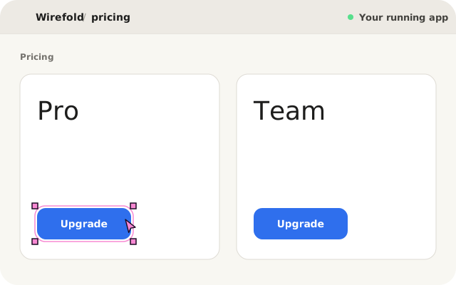
In Wirefold, open your project and view the running dev server in the integrated preview. Resize the viewport or switch to the mobile preset (375px). When the layout overflows or wraps awkwardly, click directly on the broken container or grid item.
Wirefold deterministically resolves the exact component definition in your source code, passing the model the target element along with its active responsive hierarchy.
2. Describe the responsive outcome
State the desired behavior clearly, referencing your layout system:
The agent runs inside an isolated Git worktree sandbox under .intent/worktrees. Your active branch and unstaged changes remain completely untouched.
3. Review the responsive diff across viewports
Once the agent finishes, inspect the exact diff. A surgical responsive fix should only alter container utility classes or layout props:
- <div className="grid grid-cols-3 gap-6">
+ <div className="grid grid-cols-1 md:grid-cols-3 gap-4 md:gap-6">
Before touching your project files, test the result live in the sandbox preview. Resize the preview frame from 375px to 1280px to verify both mobile stacking and desktop layout before accepting.
4. Apply cleanly to your branch
When the layout behaves as expected across all breakpoints, click Apply. Wirefold merges the reviewed sandbox worktree directly into your active working tree with index-aware auto-stashing.